Sport is the Through Line — Connecting Fans to the Teams They Love.
The sports journalism category often goes wide but not deep. The Athletic
creates in-depth sports stories, written by a high-caliber roster of writers worldwide. Reaching over 1M subscribers, The Athletic needed to develop their brand story, expand their creative toolkit and create new awareness on a global scale.
We wanted to capture the publication’s sense of care, rigor and optimism as a strategic foundation. The brand’s purpose—to immerse fans in the power of sport—puts fans first, while recognizing the emotional and cultural impact of sports in their lives.
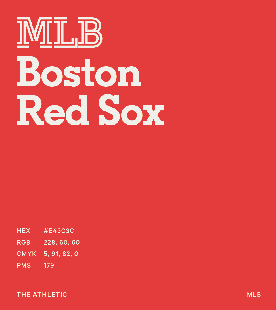
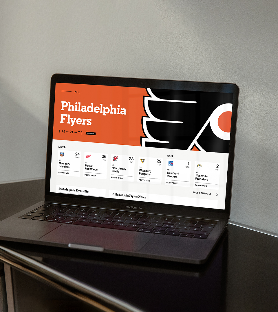
The visual identity draws a direct line between fans and sport. Using the inline monogram as a starting point, the system expands to embed the inline throughout the identity. This brand signature evokes a sense of continuous connection, drawing readers deeper into each story.
In all, the identity system allows for consistent, yet endlessly varied expressions and amounts to an elevated and approachable brand, appealing to die-hard sports fans while drawing new ones in.
Client: The Athletic
Agency: Gretel
Year: 2020
Collaborators: Greg Hahn, Ryan Moore, Simon Chong, Dylan Mulvaney, Andrea Trabucco-Campos, Kerry Griner, Nicholas Samendinger, Szeki Yang, Lynn Song, Chihao Chang
Type Foundry: A2-TYPE
Agency: Gretel
Year: 2020
Collaborators: Greg Hahn, Ryan Moore, Simon Chong, Dylan Mulvaney, Andrea Trabucco-Campos, Kerry Griner, Nicholas Samendinger, Szeki Yang, Lynn Song, Chihao Chang
Type Foundry: A2-TYPE

In partnership with A2-TYPE, we created a bespoke font, Athletic Regular Slab, drawn as a display pairing to A2-TYPE’s geometric Regular Slab. Sporting bold slab serifs and a continous, layered inline, the typeface drives the brand’s connection to its stories through every headline.