Wildly Engineered
— Supreme technicality tested to explore the wild
Founded by a small group of industry iconoclasts in 1993, Mountain Hardwear gained credibility and praise from outdoor enthusiasts everywhere.
On the heels of a four-year journey around new internal alignment, a reenergized product strategy and a desire to connect with a wider audience across more outdoor verticals, Mountain Hardwear was ready to refresh its brand positioning and modernize its identity.
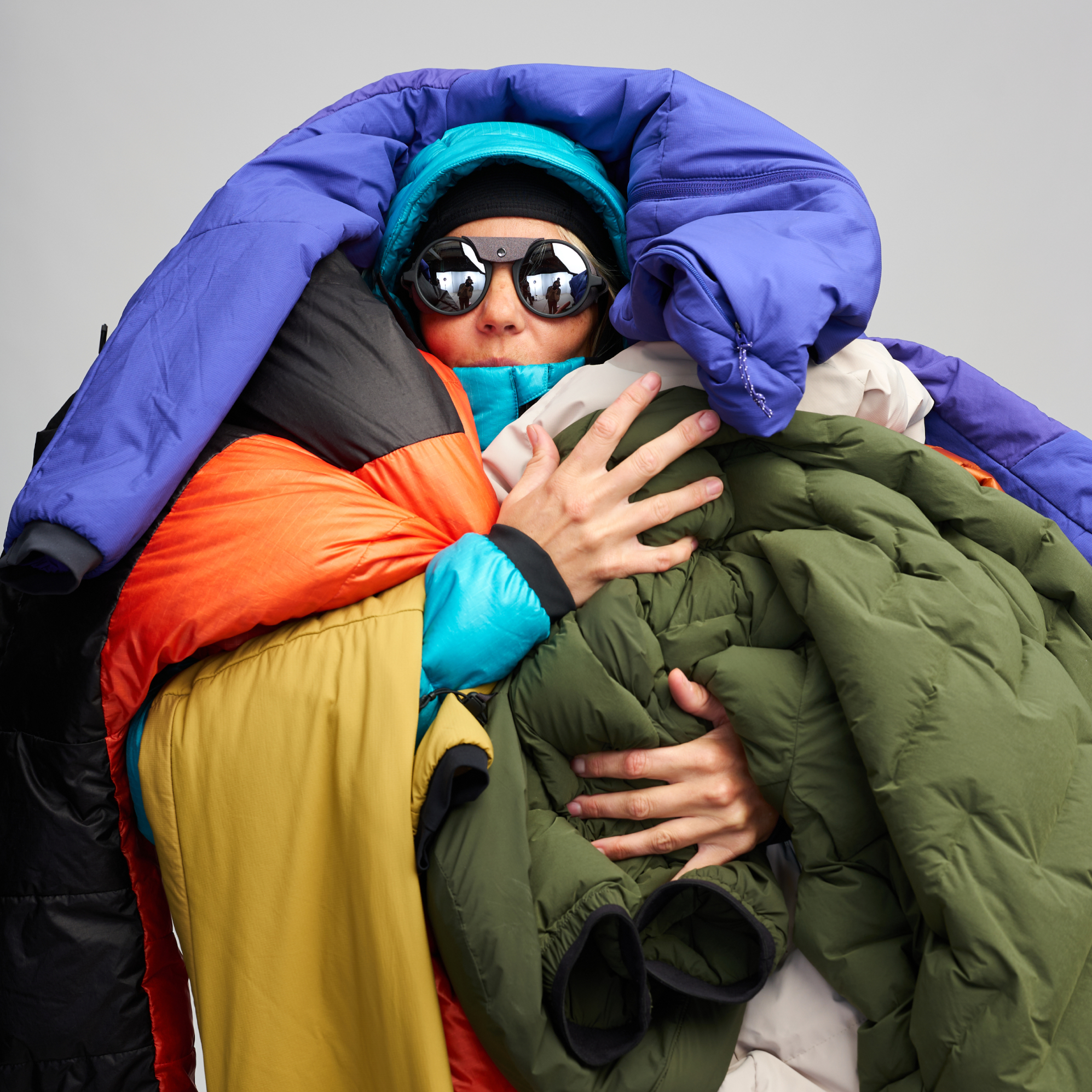
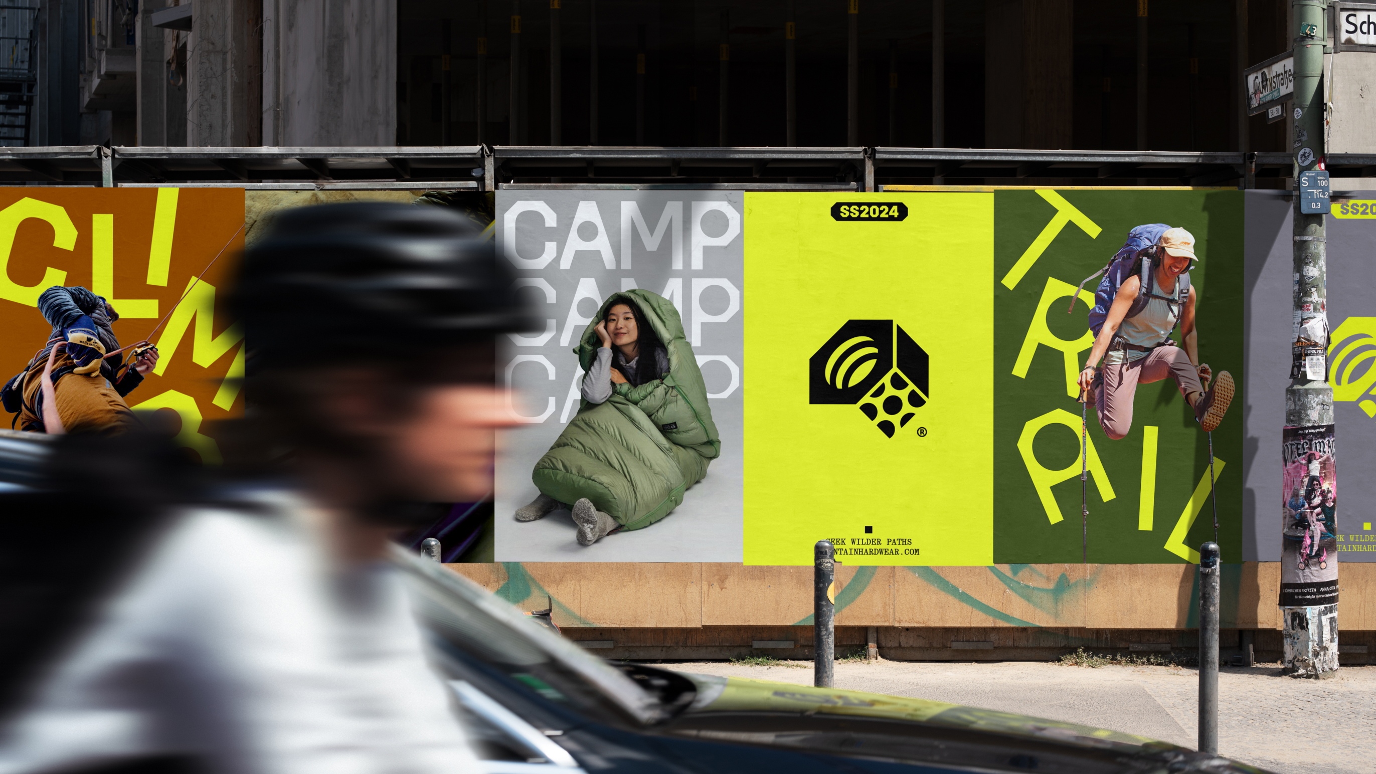
The name Mountain Hardwear inhabits the spirit of people who are passionate about outdoor adventures and well-engineered gear. Marrying the adventurous spirit and responsible, thoughtful craftsmanship of outdoor equipment, we anchored the brand personality in a dynamic tension between wild and wise—resonating with outdoor enthusiasts and athletes alike, and expressed in messaging across five fields of play: camp, climb, mountaineering, trail and alpine sports.
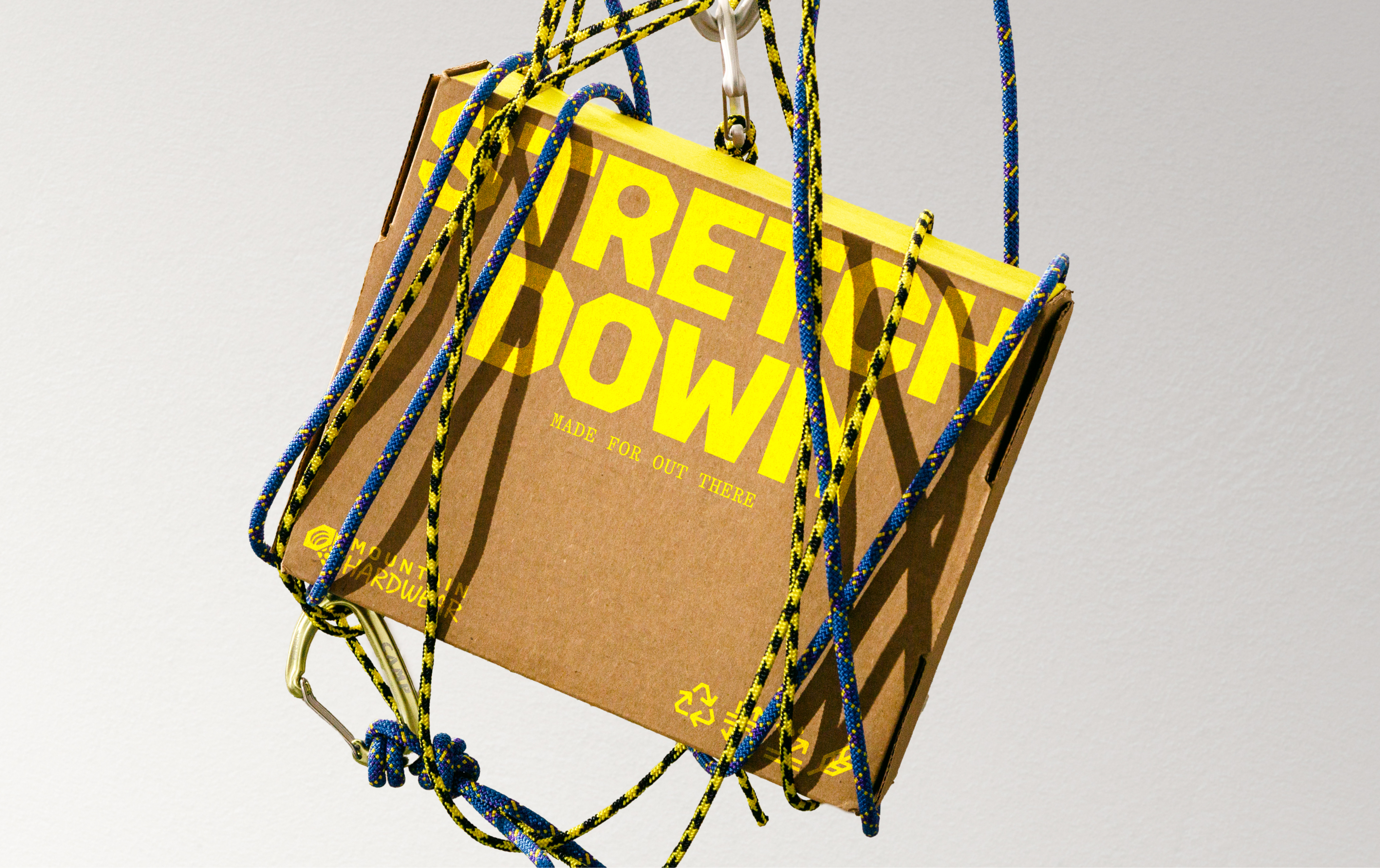
We worked closely with the Mountain Hardwear team to develop a new identity, grounded in a revitalized purpose, positioning and tone of voice, and brought to life with an evolution of the logo, new art direction, brand color, and a custom typographic family that is based on the iconic geometric elements of the Mountain Hardwear nut.
Client: Mountain Hardwear
Agency: Gretel
Year: 2023
Collaborators: Andrea Trabucco-Campos, Cyrus Cumming, Zoe Lin, Suyoung Yang, Alaijah Hampton, John Choi
Type Design: Andrea Trabucco-Campos, SuperContinente
Photography: Mountain Hardwear Brand
Agency: Gretel
Year: 2023
Collaborators: Andrea Trabucco-Campos, Cyrus Cumming, Zoe Lin, Suyoung Yang, Alaijah Hampton, John Choi
Type Design: Andrea Trabucco-Campos, SuperContinente
Photography: Mountain Hardwear Brand


A typeface born out of the symbol
We developed a custom typeface at Gretel, named Hardwear, that combines the rugged precision of technical engineering with the comforting confidence one feels when geared up in Mountain Hardwear.
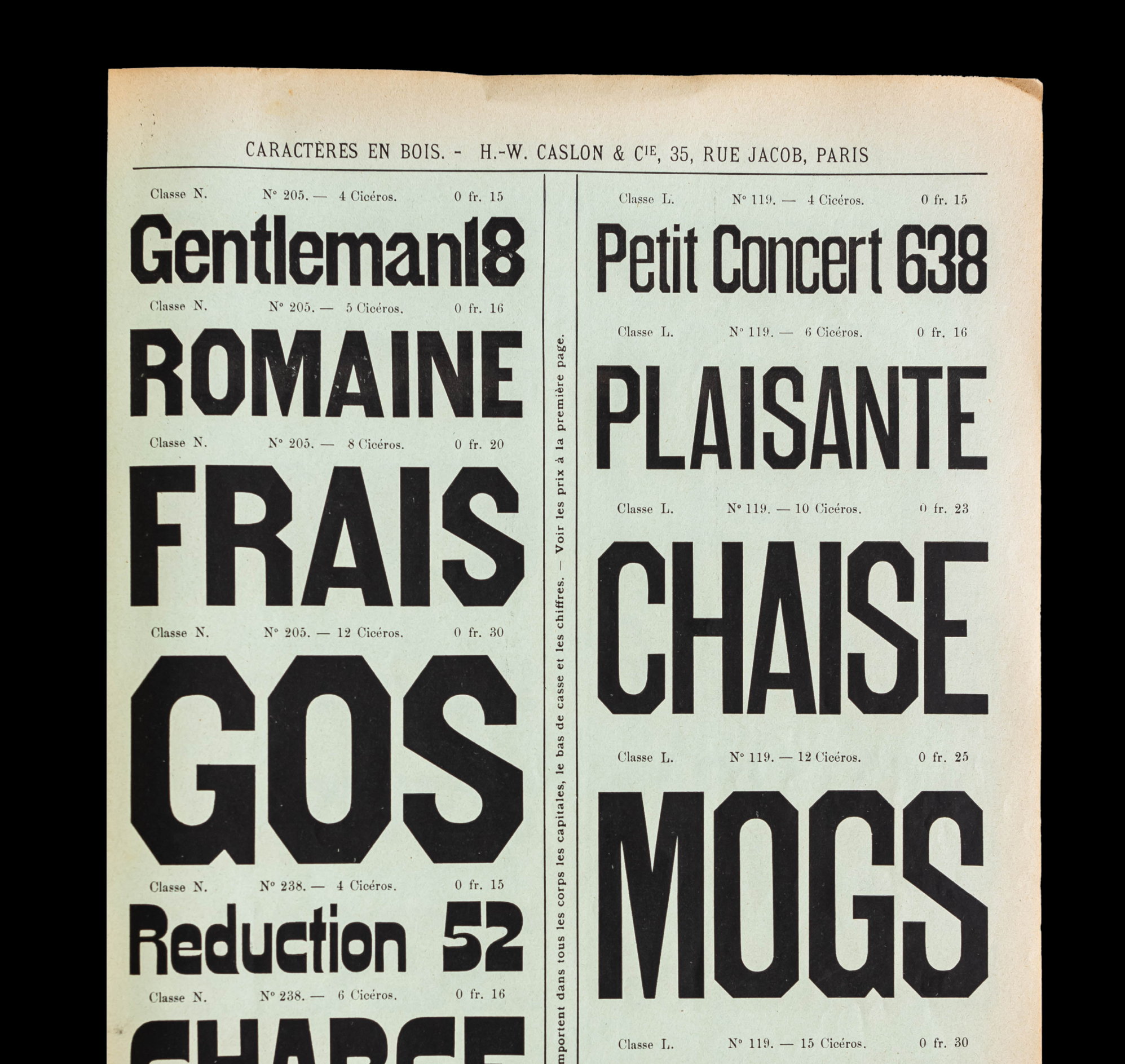
The Hardwear type family is a visual extension of the company's longstanding symbol, which has been part of its identity since the beginning: it draws on the combination of a hard outside with a soft interior, which was a reoccurring theme in wood type from the late 1800s. We’ve extended this metaphor of hard and soft to develop a broad range of styles that allows us to convey a spectrum of attitudes, from straightforward and technical to direct and irreverent. We worked with foundry SuperContinente to font production, lowercase, and hinting. Every design element conceptually and visually reinforces the next, all powered by the idea of wild engineering.
The supporting Quadrant Text and Mono are subtle references to maps and topographic notations, adding an important typographic texture that contrasts the boldness of Hardwear.

The evolution of an icon

The company's longstanding symbol, which has been a part of its identity since its origins, is unique and carries a lot of recognition in the outdoor space.
The geometry of the symbol has been streamlined to obtain a stable square, which accentuates the angles present throughout the identity both in the typeface and graphic forms.
For the evolution of “Hardwear”, we worked with SuperContinente foundry to make the overall letterforms of the script (based on Roger Excoffon’s Mistral) simpler and more consistent in weight and proportion. The word “Mountain” is now typeset using our custom typeface.
Fields of Play
The color palette was extended beyond the core brand colors, Black, Gray, and Sun Yellow in order to differentiate and clarify the various product offerings at Mountain Hardwear.
In addition to color, a series of base particles are used to create badges and dynamic patterns that are specific to each field of play. Typography also reinforces this difference, with the weight of the font responding to the altitude of the activity: heavier layers are worn in mountaineering, therefore the weight in use is Hardwear Extrabold.
A re-imagined digital framework
A comprehensive digital system was developed to articulate the identity natively on the web, while maintaining the vital eCommerce function. Modules and buttons feature the signature chamfered corners, reinforced by the use of custom typeface. The main brand color, Sun Yellow, is used throughout as a signifier of interaction.


